The Dance Studio Owner’s Guide to Building a Website That Actually Works
The Dance Studio Owner’s Guide to Building a Website That Actually Works

By Mago Lauritzen
If you’re a studio owner, your website isn’t just a digital flyer, it should be your hardest-working team member.
But let’s be real: most websites in our industry are doing the opposite: They confuse, overwhelm, or straight-up scare away potential students.
Let’s fix that.
In this post, we’ll walk through what actually matters on a studio website, what to stop doing, and the simple shifts that can boost your enrollments (without adding more chaos to your plate).
1. Your Website Has ONE Job
Before we get into design, tech, or SEO… let’s zoom out.
The job of your website is not to answer every possible question. It’s not even to showcase your full schedule or explain your tuition policies.
👉 The job of your website is to start conversations with people who are interested in what you offer.
That means collecting contact info (name, email, phone) from people who might want to join your studio. That’s it. Everything else is extra.
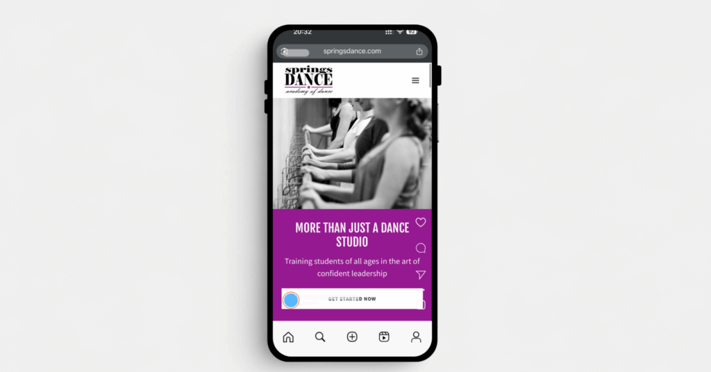
2. Design for Mobile First
Most of your traffic is coming from a phone, especially if you’re running social media ads.
Your site needs to:
Load fast
Look clean on a small screen
Make the call-to-action (like “Get Started”) super obvious and easy to tap
Don’t design your website on your laptop and forget to check how it looks on mobile. Mobile first, always.
This one change can improve your website’s conversion rate instantly.
3. Don’t Overshare: Create Curiosity, Avoid Overwhelm.
Your website’s main focus should be on capturing prospects’ information.
Avoid posting:
Full dance schedules
Pricing tables
Policy documents
Instead, encourage visitors to fill out a contact form in order to get all the information.
Why? Because curiosity sparks action.
Once a prospect contacts the studio to ask about pricing or schedule, we can start a conversation with them about what’s the best plan moving forward.
Real conversations are the start of an enrollment.
During recital season or back-to-school rush, it’s easy for follow-up to get buried.
But when each step is clearly mapped out and assigned, your staff doesn’t have to think about what to do next. The system tells them.
And that kind of structure gives your studio a professional edge. Parents feel like they’re dealing with a well-run, responsive business, which makes it easier to say “yes” when it’s time to enroll.
4. Speak to Beginners, Not Professional Dancers
Most of your traffic will be from parents or adults new to dance, not professionals.
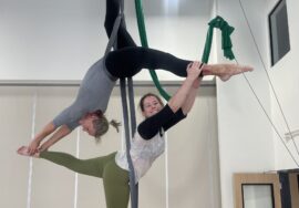
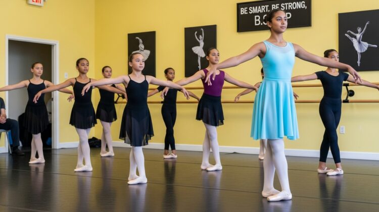
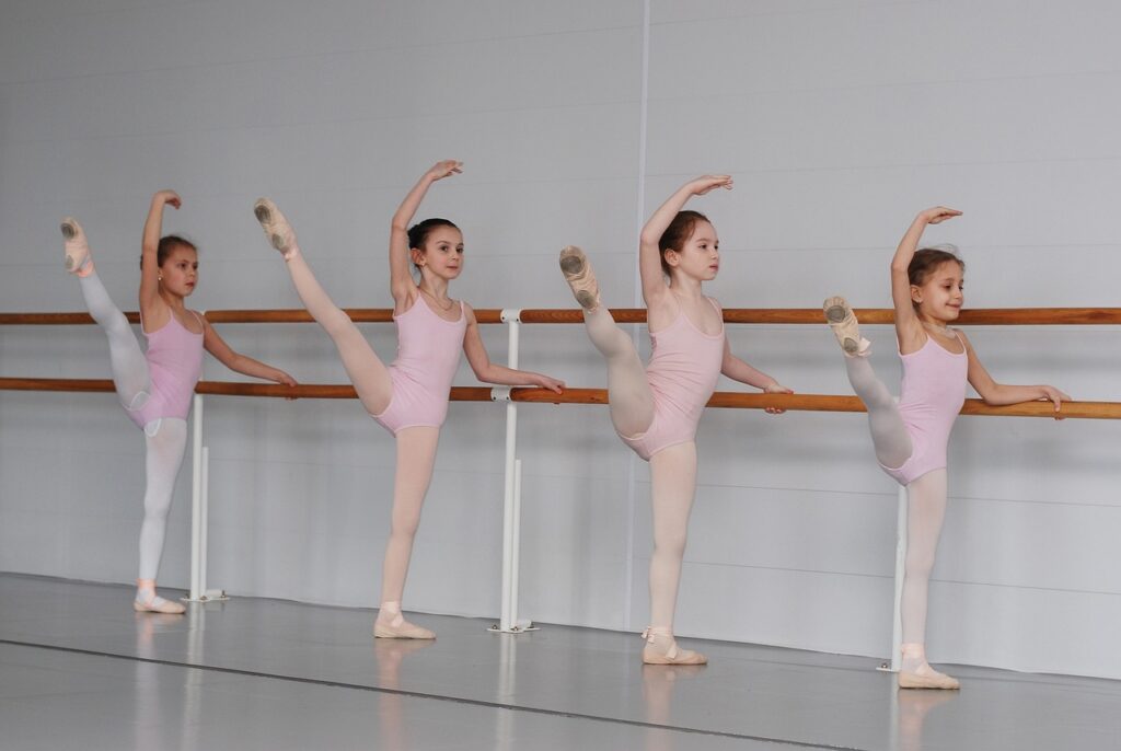
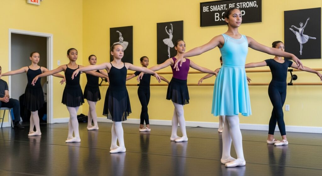
✅ Use beginner-friendly photos
✅ Avoid intimidating dance terms
✅ Keep your messaging simple and warm
Your site should make visitors feel like they belong, even if they’ve never taken a dance class before.
5. Use a “Thank You” Page to Track and Guide
After someone submits your contact form, redirect them to a custom Thank You page.
This does two things:
Tracks lead conversions more accurately
Lets you reinforce what happens next (ex: show testimonials, videos, or bonus offers)
This one page can build trust and improve your follow-up results, and set the expectation for your prospects.
6. Keep Navigation Simple
Here’s a quick rule:
4–5 menu items max across the top of your homepage.
Avoid deep dropdowns or complex menus. Your most important pages are:
Home
Programs
Get Started
About
Contact
Simple navigation = fewer bounces and more leads.
7. Give Fewer Options (And Increase Enrollments)
When visitors have too many options, they get overwhelmed and leave.
That’s why your “Get Started” offer should be super clear.
For example:
👉 “Try 2 Weeks of Dance for $39.99” – with one form to fill out.
Keep it simple. One offer, one action.
8. Talk About Them, Not Just You
Instead of saying:
“We have highly trained instructors with advanced certifications.”
Try this:
“Our classes help your child build confidence, focus, and lifelong skills.”
✨ Your visitors don’t care how awesome YOU are. They care about what you’ll do for THEM.
9. Make Your Contact Form Stupid-Simple
Here’s what converts best:
✅ Name
✅ Email
✅ Phone
✅ Notes (optional)
Every extra question drops conversions by up to 5%. So don’t ask for addresses, birthdates, or medical history yet. That’s for later.

10. Create Evergreen Pages + Limited-Time Landing Pages
Your main site should stay simple and evergreen.
Then create dedicated landing pages for events like:
Open Houses
Summer Camps
Princess Dance Camps
Recital Sign-Ups
Link them temporarily in your top menu, or promote them with ads and emails.
By keeping the website simple and organized, not only you can start conversation with prospects, but also

Want to See It in Action?
Stop losing students because of a confusing website.
Let’s fix it fast.
Book a free call and get a custom action plan to turn more website visitors into paying students—without spending hours figuring it out alone.